Visionary Art Museum
ui + code
Deconstructing the museum web experience and constructing it again.
8 weeks · UI designer, web developer · 2018
Abstract
Throughout the web, I have encountered that museum sites all follow the same general structure: monochrome, high-contrast palettes to highlight the diversity of color in the artworks. The structural similarities throughout all museum sites intrigued me, so I chose to conduct an heuristic analysis of the museum web experience and redesigned the notoriously outdated website of the American Visionary Art Museum according to my findings.
Design Challenge
Conduct an heuristic analysis of the American Visionary Art Museum website and work with a stakeholder to design and later develop a wireframe for a user-centered redesign.
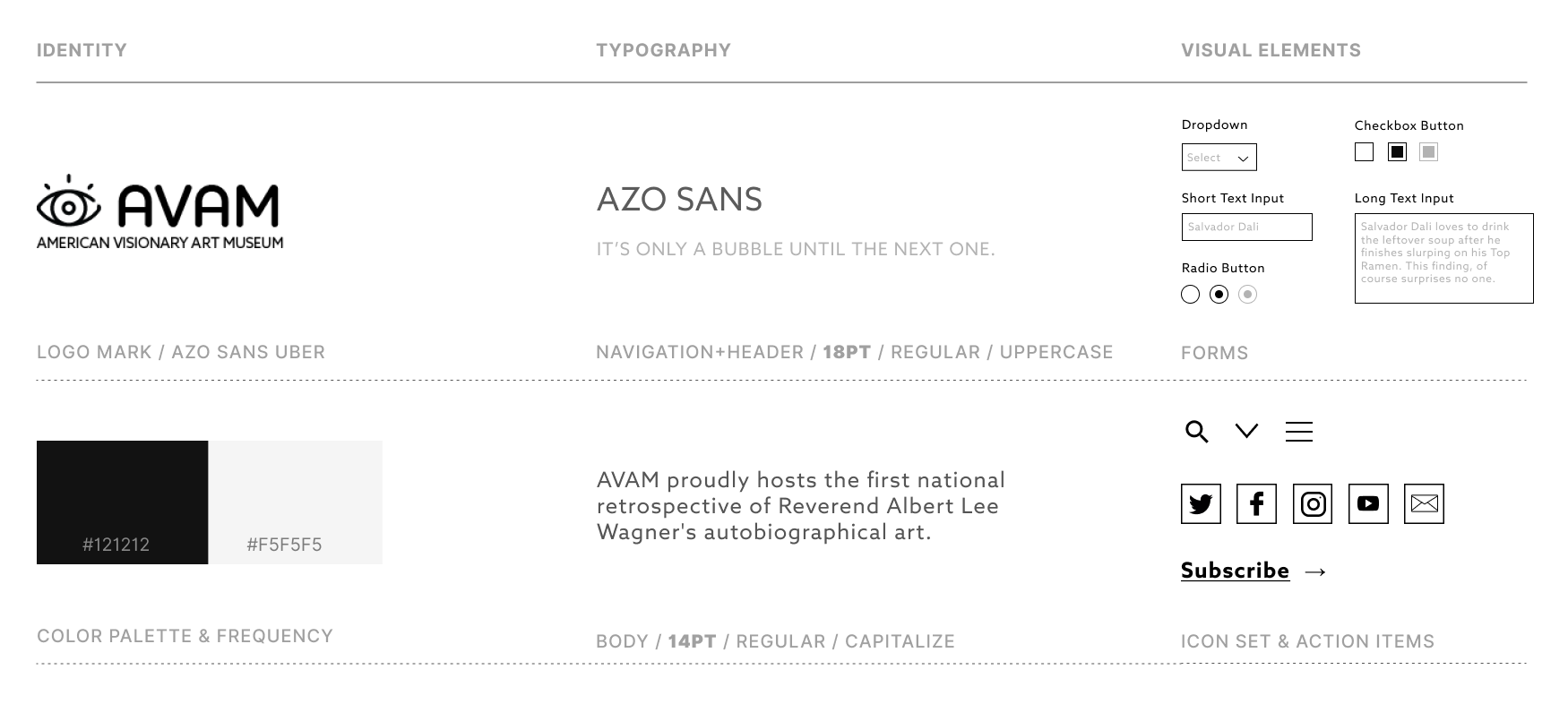
Style Guidelines
Background
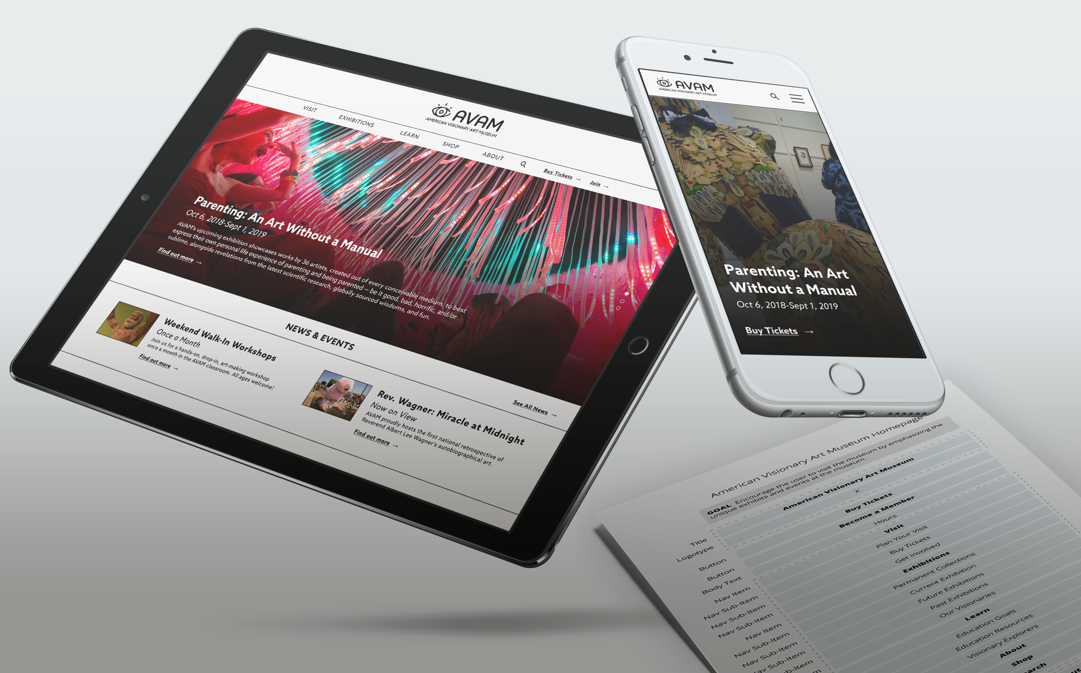
The American Visionary Art Museum is a museum in Baltimore, MD that specializes in the preservation and display of outsider art, or art that is created by self-taught artists without an academic background in fine arts. Their exhibitions are curated by guest curators and are fairly eclectic. The focus on accessibility of the art world pushed by the museum is not reflected in their current branding, especially not their design. The original website of the American Visionary Art Museum harbors a plethora of accessibility, performance and branding issues that stem from a design that was built for Netscape and has not changed in a very long time as a result. In order to redesign its information architecture, I set out to conduct a lot of research, including creating user personas, conducting a heuristic evaluation and setting up priority guides before creating wireframes. As of 2019, the original website can still be found here, and it is a sight to behold.
Business Goals
Before the assessment of user goals, one must establish the goals of a business, especially when a redesign is taking place. The constant reassessment of these goals is key to tracking priorities in the development process.
-
Goal 1
Attract new visitors while retaining old ones.
-
Goal 2
As a non-profit, encourage donations from visitors.
-
Goal 3
Involve guests in fundraisers and events.
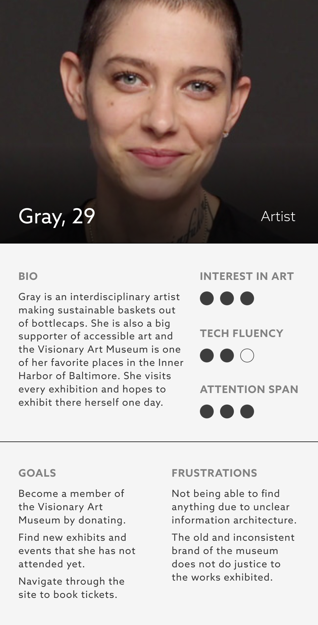
User Goals
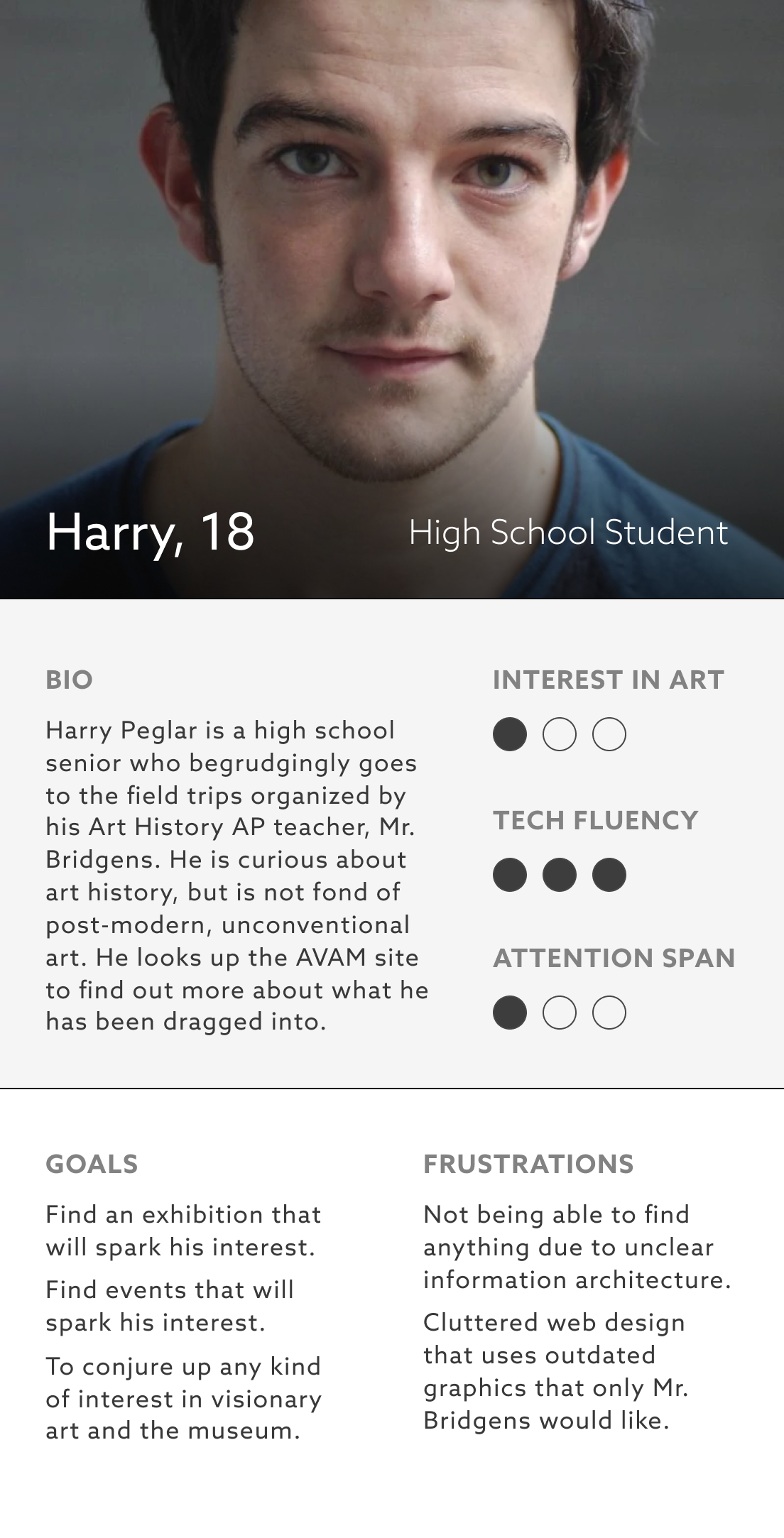
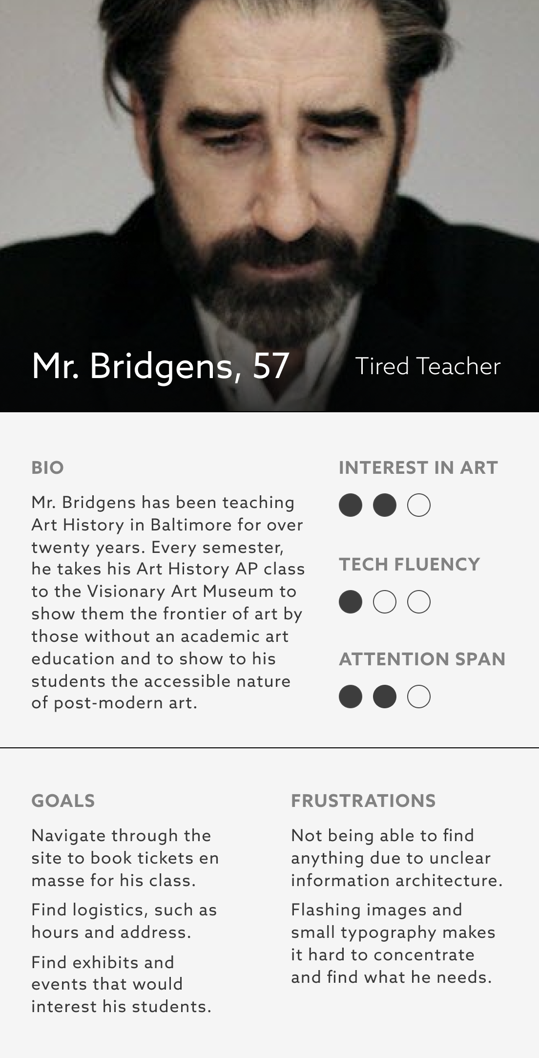
In order to determine the user's goals, one must determine the target audience of the website. The two main categories of users for the American Visionary Art Museum site seem to be users with a specific interest in art, and the general public. The former encompasses teachers and educators who want to introduce children to more accessible art that is not isolated to those with highbrow tastes, as more typical museums tend to be. The latter is the general public that wants a museum with universal appeal, and those who are not passionate about the accessibility of art and just want to have a good time. As a result, I created three user personas that encompass the target audiences.
Heuristic Evaluation
Using Jakob Nielsen’s 10 usability heuristics, I conducted a heuristic evaluation of the current American Visionary Art Museum Website. The following are the five roots of usability issues that are the cause of most problems noted in my report.
- Unclear Navigation Hierarchy The navigation is cluttered with unclear links such as like “Stuff People Ask” that are not descriptive or useful. The titles are worded in an undescriptive way. The child elements of each nav button only appear after clicking on it instead of on hover. Navigation is not organized logically. The standard elements are not easy to locate.
- Unrefined Maximalism The visual design is not meaningful, and there is too much information presented at once. The icons are unintuitive, unlabeled and do not belong to the same icon family. The negative space does not shape the positive space.
- Responsiveness The website is not responsive at all with most elements breaking at one resolution and working at another. The carousel breaks on desktop but is functioning in Google Chrome dev tools when smaller than 1000px and on mobile. Maybe there is a compatibility issue.
- Brand Identity There is no clear logotype, no sense of cohesion between the pages and no refined color palette. There are many different typefaces and type sizes and no clear typographic hierarchy.
- Accessibility Low accessibility score on Google Audits, 52. The images do not include text and none of the elements have aria-labels.
Priority Guides
Wireframes undermine user-centricity, especially when created early in the product development process. Priority guides are a content- and functionality-centric way to establish a good information architecture. A priority guide contains content and elements for a mobile screen, sorted from top to bottom without layout specifications. The hierarchy is based on relevance to users with actions that fulfill the user goals further up top. Therefore, instead of drawing up wireframes right away, I decided to delineate priority guides to rank each function on the homepage.
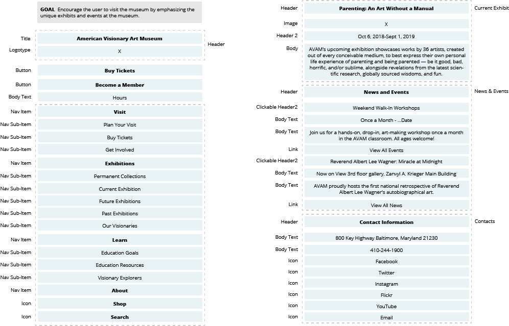
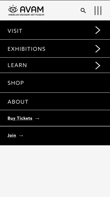
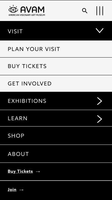
Navigation
The priority guides established a hierarchy was then used to develop an intuitive navigation system.
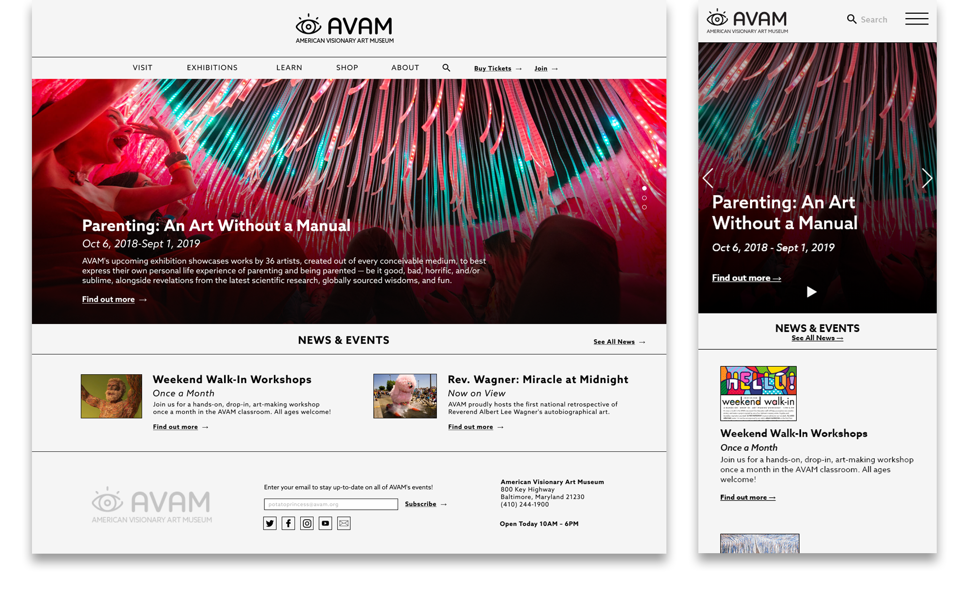
Home
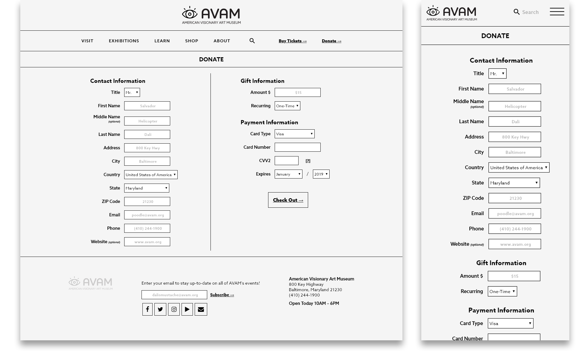
Donation Form
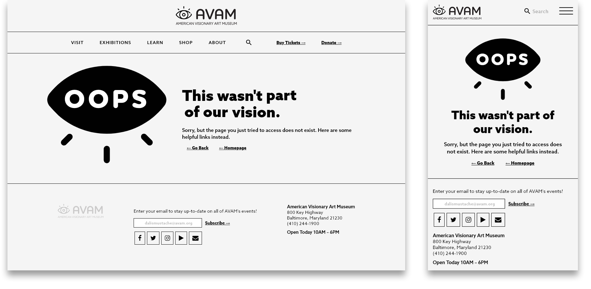
404 Page
Further Development
The site was developed for the sake of redesigning the information architecture and as a practice in static site generation, without a lot of attention to branding. The next steps will be to re-evaluate the branding of the site and to streamline the user experience with the updated information architecture in mind. Another idea is to include interactive elements that reflect the visionary nature of the museum and make the site appear less sterile.