MadLads
ui + code
A web game of Mad Libs with image recognition.
36 hours · UI designer, web developer · 2019
Abstract
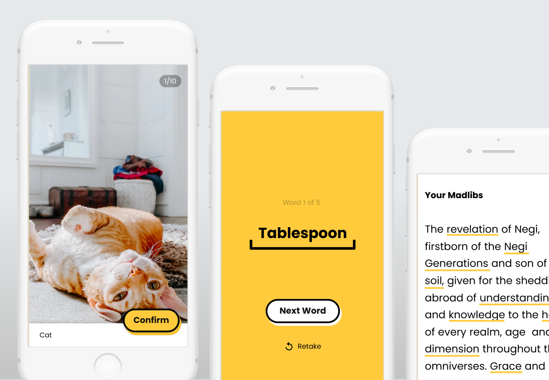
Created at the BitCamp hackathon in 36 hours, MadLads is a mobile web app reinvention of the famous phrasal template word game called Mad Libs, in which a player is prompted to fill in blanks to create a custom story. Amanda Yeh and I took the same concept and incorporated machine learning and image recognition into the process of choosing words. In order to pick a sufficiently out-of-context word for the blanks, the user takes a photo of an object, which is then recognized and inputted into a list. After choosing up to five words, the user is presented with the crafted story, often humorous. The user then has a choice to try again for a different story with different words. The project received the "Best First Time Hack" award at the hackathon.
Design Challenge
Develop a mobile app that has a simple user flow to reflect a game of Mad Libs in only 36 hours. Work with machine learning libraries to develop an image recognition system.
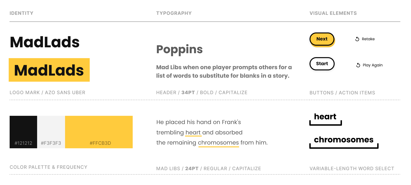
Style Guidelines
Inspiration
Inspired by the ml5.js machine learning library and Google's emoji scavenger hunt, Amanda Yeh and I decided to create a similar game that incorporated neural networks for image recognition models to create an entertaining experience for the user. This is the first time we dipped our toes in the vast ocean of possibility that comes with machine learning. The thematic inspiration came from the game Mad Libs, a phrasal template word game where one player prompts others for a list of words to substitute for blanks in a story, before reading the – often comical or nonsensical – story aloud.
Machine Learning Methodology
We used ml5.js, a pre-trained, web-friendly machine learning library based on Tensorflow that allowed us to create web applications that use machine learning processes on the web. We integrated the image recognition portion of the library with a live feed and used p5.js and vanilla Javascript to create an interactive, entertaining experience in the form of an AI-assisted Mad Libs game.
User Flow
We started with developing user flows for the app, starting from something as complicated as the one below:
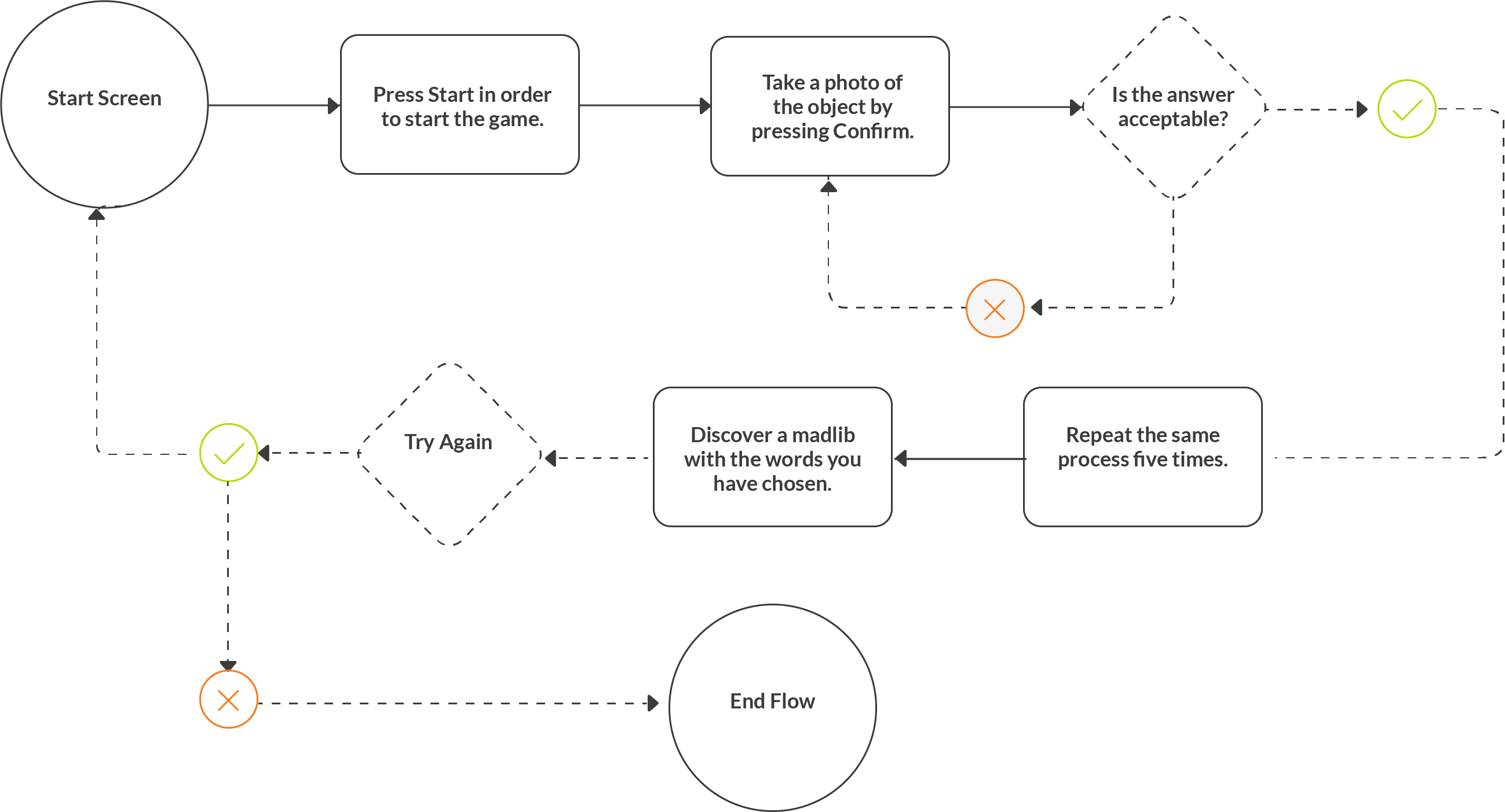
And ending with something as simple as the following user flow:

Iterative Evolution of the Interface
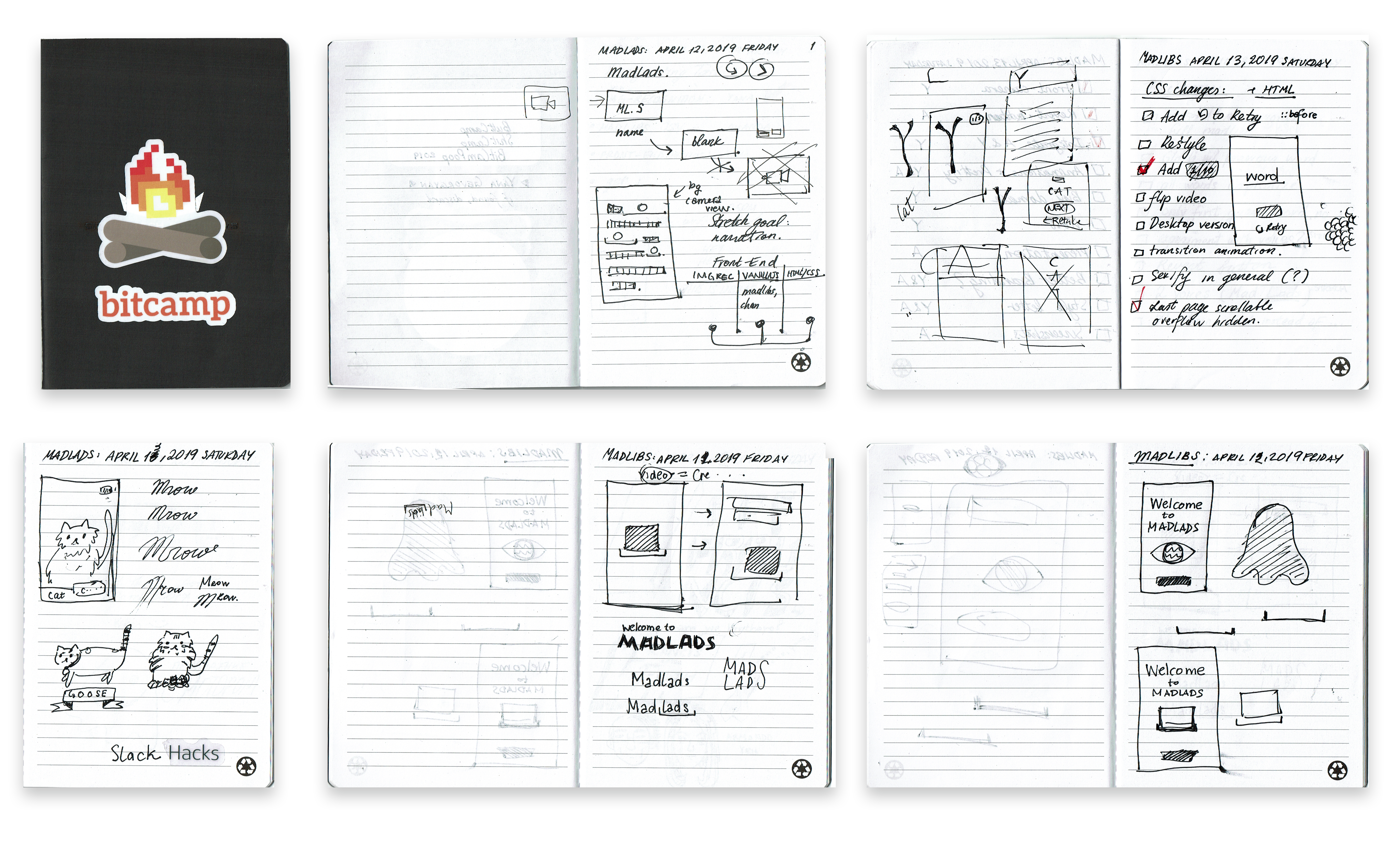
I created simple sketches to brainstorm different aspects of the interface.

Onboarding Experience
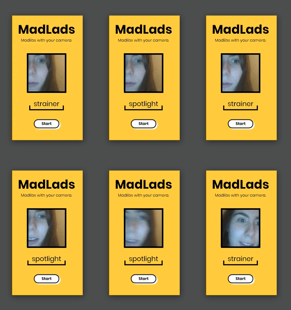
We included some image recognition aspects on the start page in order to intrigue the user and give them a summary of how the prime feature functions. In the gif demonstration to the left, I am testing out the wild inaccuracy of the image recognition software to demonstrate the rapidly changing words. To really shock the viewer, for the main page, we lowered the probability model to 0.5 / 50% probability in order to receive more random results. This makes the guesses to channel through faster for a more animated flow of words, intended to confuse and inrigue the viewer.
Final Solution
Challenges & Accomplishments
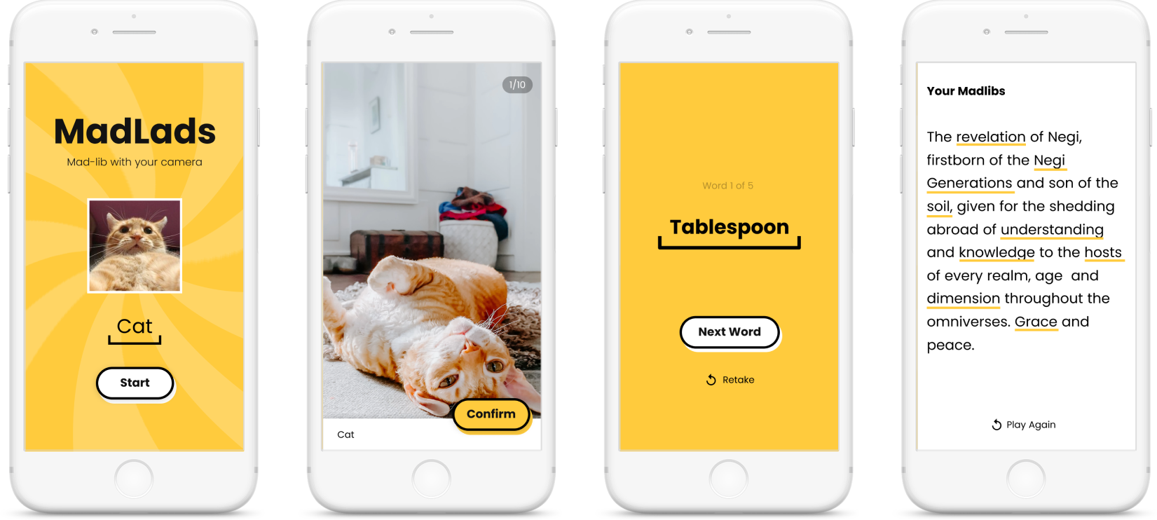
It was a challenge to incorporate an environment-facing camera for mobile. However, in the end, we solved the issue by linking Google Chrome Dev Tools to our phones and learned that we had a simple syntax error in the createCapture object. In addition, the text-to-speech synthesis had a few glitches involving repeating strings of sentences, but it was fixed. There were also some tweaks required to adjust the sensitivity of the image recognition. We are proud of the smoothly functioning image recognition and phrasal template system, and our user experience design. We paid close attention to giving the user helpful feedback and options, such as allowing them to retry to capture the word and providing them with a little counter to keep in mind how many images they have left to take. Another example of user experience that we are proud of is our consistent style guides and interactive onboarding in the first slide, where the user can start trying out the image recognition system from the get-go.
Awards Received
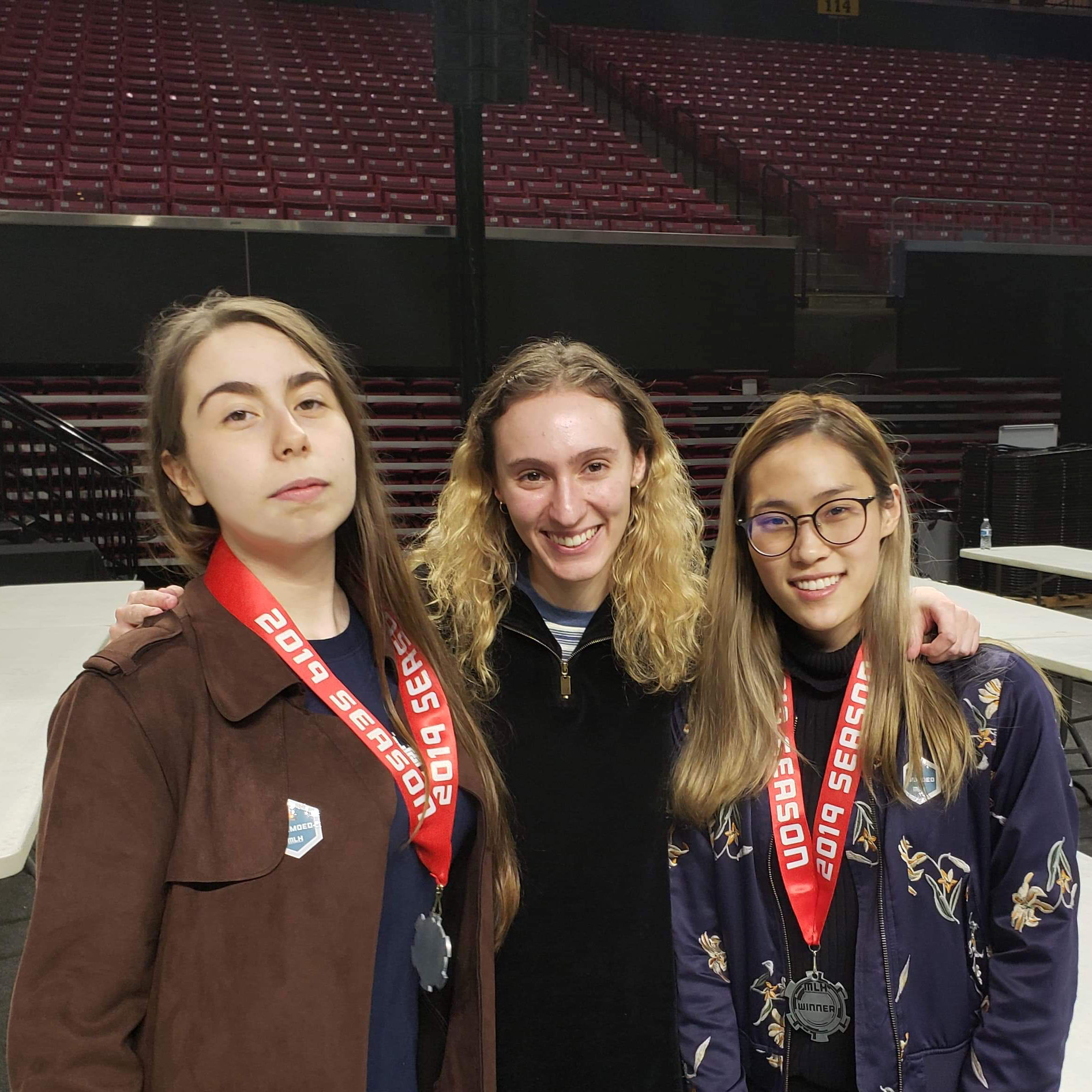
As the only graphic design students at the hackathon outside of the designer-only challenge, we were outnumnbered by computer science students. The product developed by us, Amanda Yeh (pictured far right) and I (pictured far left), received the "Best First-Timer Hack" award out of 1300+ people at Bitcamp 2019, with the judge citing the app as one that has the "most thought out UI he has ever seen at a hackathon." We still cannot believe that we got the announcer to say the word "Madlads" in front of 1300+ people. In this image, Amanda and I haven't showered or slept in over 40 hours. Fiona Cohen (middle) is a fellow MICA student and she received the Design Den award at the same competition.
Future Developments
We would like to rewrite a lot of the code base, because much of it was done in a hurry without proper programming conventions and best practices. This should better our site’s performance. Another idea is to create a desktop version of the site that either redirects one to the mobile version or is a game in its own right. Re-working the UI is a real possibility after we observed and recorded the challenges the users experienced during the judging session.